![]()
 Humans have remarkable ability that is shared by – as far as we know – no other animal. We can turn abstract images and symbols into meaning. Words are, of course, the prime example, as old as our history. We can turn a word like dog, tree, table or vacation into a broad and deep understanding of what that word means to us.
Of course when I write “dog” and you read it, they’re not the same thing. I need to add qualifiers – adjectives, descriptions, anecdotes – for you to come close to appreciating my meaning. Even then, it’s still based on your and my individual emotional experiences. And they’re likely not aligned or similar. Nonetheless, it doesn’t stop writers from discussing dogs, from describing dogs.
But like molecules are made of atoms, and atoms of smaller particles yet, and those made up of quarks, sentences are made of words, words are made of letters, and letters are made strokes. The jot and tittle of Biblical phrase.
The amazing thing with the human brain is that we can take a collection of slashes, lines, strokes and dots and transform it into a letter and thus into a word. We take the abstract and solidify it.
Dissect an ‘A’ and what do you have? Two angled and one horizontal line. In lowercase – ‘a’ – we see two curves, one cupped against the other.
But in the human brain that’s a letter; a vowel, an indefinite article. It’s a crucial component in writing and speech, one of five (and sometimes six) sounds that connect the vertebra of consonants. Tens of thousands of words depend on those simple lines. We could not do without the letter A. it is part of the genetic makeup of language. Yet by itself it’s just some lines on a page.
The letter “A,” we told, comes from the Phoenician aleph: a stylized bull’s head, rotated with use (see here). Today we’re using symbols created 3,000 years ago (although our Western alphabet – Latin – is really a creation of the Romans, dating back more than 2,700 years, although in today’s form and content about 2,100 years old. Consider the heritage in that, every time you type a Facebook post, an email or write a letter: the history of writing is ancient.
The alphabet is a remarkable invention. It turned human vocal sounds into abstract symbols, it codified the world into abstract symbols. Humans assembled a series of strokes, lines and curves to define language. And we did it a long time ago – in Egypt in the 27th century BCE by most accounts. More than 4,700 years ago. Others identify it with Sumerian culture, somewhat earlier. Either way, it’s pretty impressive and probably the most important human invention. Clive Thomson writes in his book, Smarter Than You Think,
Writing — the original technology for externalizing information — emerged around five thousand years ago, when Mesopotamian merchants began tallying their wares using etchings on clay tablets. It emerged first as an economic tool. As with photography and the telephone and the computer, newfangled technologies for communication nearly always emerge in the world of commerce. The notion of using them for everyday, personal expression seems wasteful, risible, or debased. Then slowly it becomes merely lavish, what “wealthy people” do; then teenagers take over and the technology becomes common to the point of banality.
(I don’t agree entirely with Thompson’s assessment that writing is on the same technological level as, say, an iPad or the internet, nor that technology makes us smarter; in fact I argue the opposite in that technology makes it simpler to do things, so we work less at them. But I sigress and will save that argument for another post.)
But letters are not rocks: they are not fixed in the firmament. They change, they evolve like living things.
The design of those letters has been debated and developed since the first words were scratched into rock. But it really became an art when the printing press was invented, thanks to Johannes Gutenberg. And ever since his invention, people have been debating what makes a good, readable, legible and aesthetically pleasing typeface. Sometimes with great emotion.
Robert Bringhurst, in his book The Elements of Typographic Style, made a comment typical of the passion that type raises in its aficionados, designers and critics:
In a badly designed book, the letters mill and stand like starving horses in a field. In a book designed by rote, they sit like stale bread and mutton on the page. In a well-made book, where designer, compositor and printer have all done their jobs, no matter how many thousands of lines and pages, the letters are alive. They dance in their seats. Sometimes they rise and dance in the margins and aisles.
Type and typography creates in some people the fiery emotions we see in other arts.*
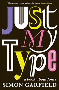
In his book, Just My Type, Simon Garfield asks,
…when we choose Calibri over Century, or the designer of an advertisement picks Centaur rather than American Gothic, what lies behind our choice and what impression do we hope to create? When we choose a typeface, what are we really saying? Who makes these fonts and how do they work? And just why do we need so many?
Indeed. Do many of us actually ask such questions when we choose a font from the menu of choices, or do we simply go with the gut emotions, the look that suits our current state of mind? The latter, I suspect. Most of us don’t consider fonts any more than we consider the gasoline in our cars. We fill up the tank with the same emotions with which we choose fonts. This emotionless choice is why most people create documents of agonizingly bad typography, jumbling fonts like children with blocks.
Others treat each font choice, each decision to pair typefaces like a major life decision. Determining which body font matches which headline font equates to asking which wine goes with a particular fish dish, which colour paint matches the living room furniture, or which craft beer pairs with this particular Stilton. These things matter. When they don’t, the result is like sandpaper on the eyes. For some of us.
Garfield wrote on a BBC blog,
I’m grateful I’m not alone. There’s a whole load of us out there, and not all of us are in graphic design or therapy. We convince ourselves that typefaces are beautiful things (they are, or at least most of them), and that they are capable of expressing all shades of human emotion. Typefaces – or fonts, as they are most commonly called on our pull-down menus – are like clothes for words, and we should choose them according to moods, trends and decorum. Many have fascinating histories, which is why I’ve written a book about them (and which ones to avoid at all costs).
My laptop has about 800 fonts active, out of more than 20,000 on my backup hard drive. These days I try to proactively keep the list of fonts trimmed, but some I keep from sheer nostalgia or the simple pleasure of seeing them in use. Poor Richard; Bodoni; Century Gothic; Eras Medium; Baskerville; Algerian… but today I tend to use a mere handful of common fonts like Calibri, Verdana, Trebuchet, Cambria.**
It’s been more than three years since I ran a business where type and typography were key elements in my daily work. My skills have rusted; I no longer automatically recognize by name the typefaces I preferred to work with; I’ve forgotten some of the vocabulary and the rules. But I can still look at a typeface and admire it. And read about it: I am just finishing Garfield’s entertaining book about type and its often eccentric designers. Which of course made me dig up my copy of Bringhurst and look through my aging collection of design and layout manuals.
Type can be exquisitely beautiful, like the human form: soft lines, suggestive curves and connections; sensual. Type can be reserved, or exuberant, formal or casual, warm or cold. It’s emotional, not merely a vehicle for transmitting those abstract ideas. People get very involved with type, get very emotional about it. Garfield relates the great historical fights over type, as well as the great changes type has brought about. As Bringhurst wrote,
Typography is to literature as musical performance is to composition: an essential act of interpretation, full of endless opportunities for insight or obtuseness.
There’s a whole debate we can open about how the computer has allowed many people to design and create type; some gifted amateurs, some not so gifted, resulting in tens of thousands of free fonts available. Technology empowers people to do many things they have neither the skill nor the talent to do well, and, like blogging and page layout, type design is one of those areas amateurs can dive into without any education or experience to buttress their efforts.
Should we applaud their enthusiasm or criticize their failures to adhere to accepted design principles? That’s for another post, too.
The Guardian recently posted a visual list, compiled by Domenic Lippa of Pentagram Design Consultancy, of what he believes are the 10 best fonts. I’m not sure I would agree with all of the choices. Take a look and see if they ring your chimes. These are all professionally-designed typefaces, not those by amateurs, by the way. There are many such lists online, here’s another one that includes some free amateur- and designer-built fonts (many good typefaces here and here, too). Look for others.
I think it matters that we pay attention to the typeface, that we have opinions about it, that we have emotions for it, not just take it for granted.
~~~~~
* Type design and typography are separate disciplines. Type design is about how the letters are crafted. Typography is about how the type is laid out on the page. I appreciate type design but my interest is more in typography.
** Font management is important for computer users because a large collection of active fonts can slow your machine down. Since many applications install fonts without asking permission, it’s useful to use a font manager (Bitstream’s Font Manager is my choice because it comes bundled with CorelDraw, but there are many others) to strip out the unnecessary or excess fonts. Keep the total under 1,000, or even under 500 if you can. Some fonts are necessary for apps like games or music tablature editors, so make a note of the name before you remove it. It’s a good idea to back up your font directory first, so you can easily restore any fonts you mistakenly remove but need later. It can be time-consuming because many typefaces look alike to the lay person, and many free fonts are copies of commercial versions but may vary subtly in ways that are difficult to detect.

Pingback: Marketing Wow | Scripturient