
![]()
The human brain is truly a remarkable machine.* We can see a bunch of lines and in that same brain turn them into an M and know it’s not a V or an N or a K or W. Yet M isn’t a ‘thing’ – it’s an abstract representation of a sound that itself has no concrete meaning outside the Mmmmm of meditation.
When you mentally assemble a bunch of other lines and sticks and squiggles, those sounds form a larger abstraction: a word: MOON. Now we have substance. And that can be used to create even larger collections of abstractions – sentences – that together we ascribe a greater meaning to: THE COW JUMPED OVER THE MOON.
That’s a perfectly clear sentence. Nonsensical, yes, but within a tiny fraction of a second, your brain built all the bits and squiggles into a structured concept that made some sort of sense. You can read it; every word is clear and expresses something you can picture. That’s a remarkable feat of cognition that borders on magical.
But change just one letter, replace, say an O with an R and THE COW JUMPED OVER THE MORN seems much stranger, more nonsensical. Harder to imagine. THE COW JUMPED OVER THE MOOT or THE MOAN even more so. Familiarity helped us build the first; the unfamiliar – just one letter changed – made us stop and think about it. But how is it that MOON, MORN and MOOT are clear to us, even when the sentence isn’t logical, but assemblies like REET, CABIT, DRAMFIBBLE aren’t?
What about acrasial, brabeum, crocitation? Nidifice, ovablastic, patration? Saburrate, tecnolatry, yelve? Those are actually all real words, once in use, but long since fallen from use, forgotten and mostly lost to the language.
You can read these words, you can pronounce them. They obey the rules of our language construction – unlike, say pkbrynzg or tlmrifvy – but they still don’t make sense. Your brain has no familiarity, no mental foothold that lets you make sense of them because they don’t conform.
But a lost word like snobographer you can break into bits – snob and grapher – and probably work out that it means someone who writes about snobs, even if you’ve never seen the word previously. It has familiar bits.
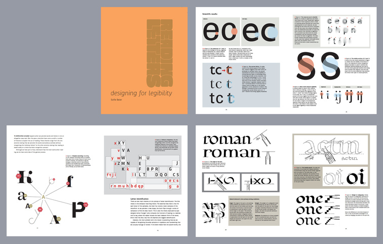
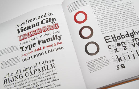
Sophie Beier‘s 2012 book, Reading letters: Designing for Legibility is almost the polar opposite of Sarah Hyndman’s book, reviewed last week. She looks at those little sticks and lines and squiggles and explores all the science and art behind how we make abstract symbols into meaning.
It’s truly a wonderful book for the typography geek: full of technical details, studies, and page after page of examples. It’s not aimed at educating the average reader: it’s aimed at opening dialogues with her peers – it derives in part from her PhD thesis – neurologists, psychologists, linguists, and, of course, type designers. It delves into the minutiae of letterforms to a depth even most textbooks on typography don’t take us. It thus engages both the scientific and design communities, a rare confluence.
She also delves into history – exploring the ancestry of type and design. How we got from hand-carved blackletter to modern digital type is a fascinating journey, but not just a story to entertain. It’s also a Darwinian evolution towards increased legibility. Beier doesn’t go back to the creation of writing itself – that most important invention in all human history – but rather only to the beginning of printing. That’s enough, rich material to draw from.
As noted at Typographyguru.com, Beier doesn’t make pronouncements about design absolutes (such as you might read in Bringhust…). Rather she discusses choices, findings, expolorations and options:
The purpose of the book is to support type designers in creating legible typefaces and help graphic designers to determine the optimal typeface for a given project. But the book doesn’t work like a “manual”. It does not list the most legible typefaces or will tell you settings for font-sizes, line-heights and so on. It’s all about understanding the principles of legibility. Definitive answers about the fundamental parameters of legibility are yet to be found… But still, even though this book cannot answer every question about legibility — if you are interested in legibility research from a typographic point of view, this is the book you need to read.
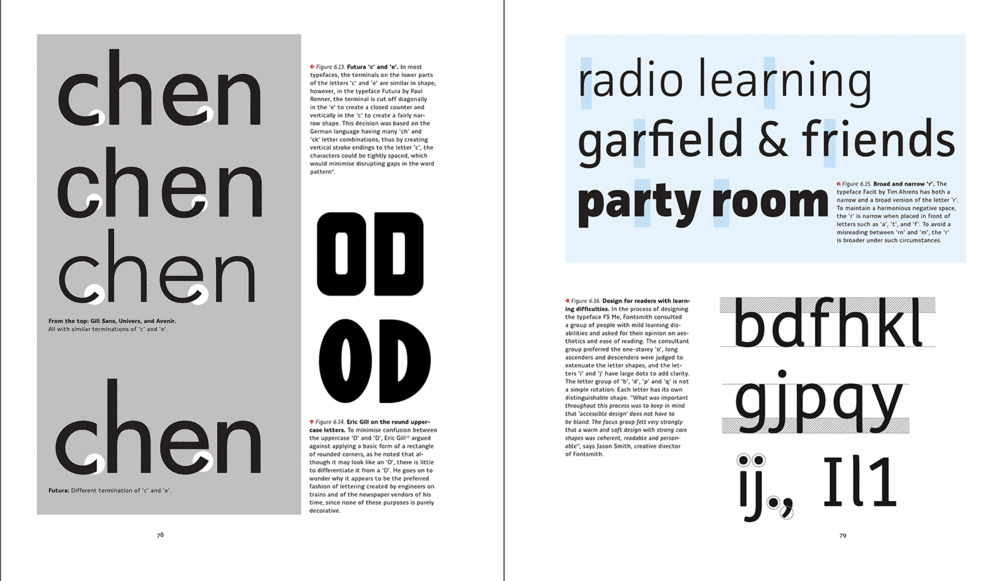
Most of what she describes is easily understood even by lay folk like me, because she illustrates her points with many, many well-done graphics that make it clear.
Here’s where it gets sticky: legibility and readibility. The two terms often get used interchangeably, but they represent different aspects of brain processing. Designer Steven Bradley sums them up this way:
Legibility is mostly a function of typeface design. It’s a measure of how easy it is to recognize one letter or word from another and how easy blocks of text are to read.
Readability is a function of how typefaces are used. It’s about how inviting your type is to read and about getting the viewer to want to read it.
A little further along, he adds these comments:
Readability applies to the overall reading experience. It’s macro-typography and it’s about making type aesthetically pleasing in order to make it more inviting to read… Legibility applies to parts of the text like letters and words and paragraphs. It’s micro-typography. It’s about type’s ability to be easily read, particularly under normal reading conditions.
But clearly they are co-joined, like Siamese twins, because both use the same grey matter to process and filter them. Yet type designers will focus more on legibility, while layout artists and graphic designers on readability. Let me give you a simple example:
The cow jumped over the moon.
That’s both legible and readable. But this:
tH E coW juMPe d o Ve R thE mOO n.
Is legible, but not very readable, even though it consists of the same letters and font. Change the font and size, and it’s still readable but legibility varies:
The cow jumped over the moon.
The cow jumped over the moon.
The cow jumped over the moon.
The cow jumped over the moon.
The cow jumped over the moon.
Mix and match: readability suffers:
The cow jumped over the moon.
Here is the same sentence in different fonts, all at 14 point:
The cow jumped over the moon.
The cow jumped over the moon.
The cow jumped over the moon.
The cow jumped over the moon.
The cow jumped over the moon.
The cow jumped over the moon.
 Readability thus depends on presentation; on the use of design elements like letter spacing, kerning, leading, typeface, x-height, contrast, line length and so on. Type designers, on the other hand, have to consider how their fonts will look in all-caps, in long lines, in small print. Will they still be readable?
Beier’s book may help type designers craft a legible typeface, but it’s value extends well beyond that rather limited employment. It will help graphic designers and layout artists choose the typeface, fonts and conditions (colour, paper, column width, etc.) that most improve legibility and readability. And for geeks like me, it’s a book full of wonder. It explains things about letters and type I hadn’t even considered.
Anyone who is involved in the business of communication, writing, layout or graphic design needs a solid foundation in at least the basics of typography. Without them, you cannot communicate effectively. Without them all you can do is stick words on paper and throw them at readers with faint hope they do their work (which they seldom accomplish).
While Reading Letters may be a bit esoteric and technical for many, it nonetheless opens horizons that might otherwise be occluded. It will help you look at letters and words in a fresh, critical eye as never before. And it will emphasize what I’ve said many times in the past: type and typography matter.
(N.B. This is a review of the second of three recent books on typography and type design I have ordered.)
~~~~~
* The Republican convention and Donald Trump notwithstanding.

Pingback: Frutiger vs Palatino – Scripturient