
![]()
 Karen Cheng’s 2005 book, Designing Type, is the third of the recent books on typography I have received*. Of the three, it is the most technical, appealing to the typophile and design geek more than the average reader. But it’s also a reference for layout and graphic artists looking to choose a specific font for a work.
If your goal is to actually design a typeface, she helps appreciate the subtleties of design that differentiate and separate typefaces and letterforms. But it’s not a book about design.
Most books on type and typography focus on the result: working for the combination of readability and legibility that create an emotional, psychological and intellectual effect on the viewer. Cheng takes us on an almost microscopic tour of type, zooming in on the minute parts.
There is a prevailing theory that type should be ‘invisible’ in that the reader doesn’t see the face, simply benefits from its effect. And, I suppose, for the average reader that makes sense. Designers usually don’t want the narrative to be interrupted by a closer examination of the font. Writers don’t want readers to lose track of the plot or theme in order to puzzle over the lack or presence of serifs. But a lot of work and time goes into creating a typeface that accomplishes that goal.
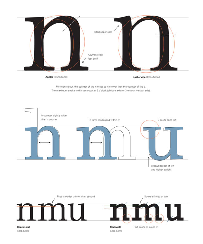 Cheng instead focuses on the actual design of both letterforms and faces, the intricacies of curves, strokes, the angles and thicknesses. And she does so in remarkable detail. There are whole pages dedicated to single letters and numbers with numerous examples showing the minuscule differences between fonts that the average reader simply does not notice. And at this level, familiar forms disappear; they become less letters and symbols and more like architectural components.
What she offers, for example, is the minute differences in stroke thickness in the upstroke and terminal of, say, a capital J. Or the differences in the angles of the legs in a capitals versus lowercase K. A double-page spread on the uppercase letter Q shows the variety of styles of tail.
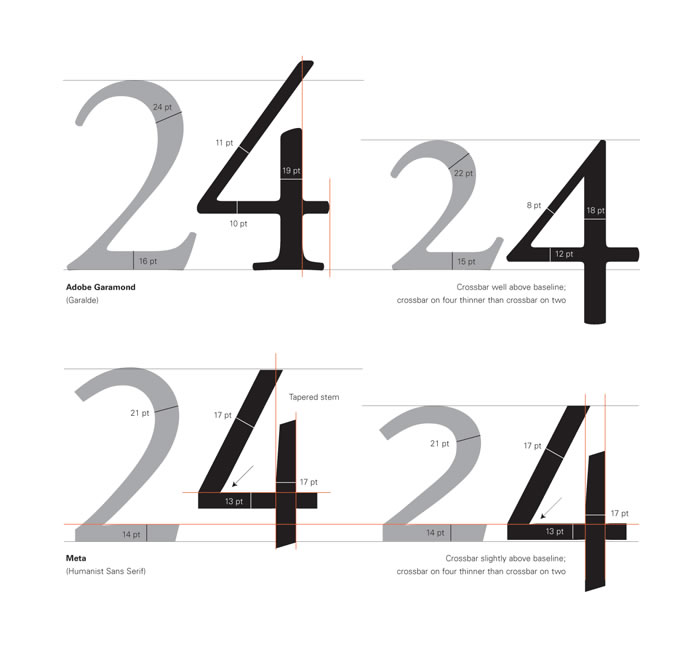 Another spread shows the variations in the number 4; stroke endings, connected and disconnected crossbar, bracketed and unbracketed serifs, the shifting crossbar… A wealth of detail to consider. Have you ever looked closely at ink traps? Now’s your chance…
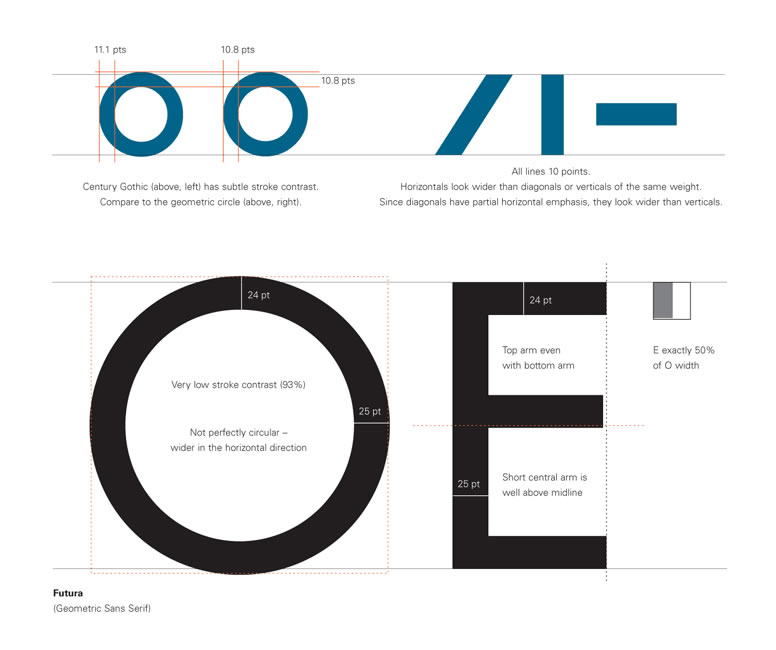
One spread shows the differences in volume occupied by upper and lowercase letters O in the same typeface, the differences shown as a percentage the lowercase occupies compared to the uppercase. It’s that kind of book: rich in detail.
Yet surprisingly, she doesn’t show complete character sets for any of her example typefaces. It’s sometimes difficult to appreciate how the letters relate to one another without having more of them to stand beside the one(s) under the microscope. I would have appreciated a chart with the full character set for each example face.
Much to my surprise and disappointment, Cheng does not even give a single spread on the ampersand. The period, comma and semicolon get a spread. Quotation marks get one. So do question and exclamation marks. Yet that most complex, stylistic and differing character, the sexy and fashion-conscious ampersand, gets short shrift; not even a mention on the general punctuation page. But look at just a few examples:

Gorgeous, aren’t they? I could wax poetic about the ampersand at length, but I will save that joy for a subsequent post.
There are precious few software tools and guidebooks to actually design and publish typefaces (and they’re expensive!). It’s a daunting task for professionals, let alone amateurs, no matter how passionate. The software itself is comparatively unfriendly, with a steep learning curve (so I have been told).
Despite the challenges, thousands of people create their own typefaces. There are tens of thousands – maybe even hundreds of thousands – of homebrew fonts online, most of them free. But you get what you pay for. Cheng herself says in the introduction:
There is no single, ‘correct’ process for creating a typeface. […] In some ways,the most difficult part of the design process is finding the initial inspiration to make a font. The vast number of existing typefaces (last estimated at 50-60,000 in 1996) can be intimidating. […] Still, the ongoing proliferation of type shows no sign of abatement; if anything, the complexity of the modern world encourages continued growth.
 Aside from the small collection of professionally-designed typefaces provided with popular word processing, graphics or desktop publishing programs, most users don’t buy additional typefaces. They download them.
The majority of these free typefaces are like homemade wine: amusing, presumptuous, sometimes entertaining, but hardly a competition for taste challenges. Quite often, too, they are designed for a limited range of sizes, and under-perform when extended beyond that range. They may lack the more subtle attributes in pro faces – kerning or hinting for example.
Designer Gerry Leonidas noted on his I Love Typography blog:
Of all the skills typeface designers need to develop, understanding how to make shapes at one scale behave a particular way in another scale is the most troublesome one. Imagining the difference that a small change in a single letter will have in a line or paragraph of typeset text is not an innate skill: it is entirely the result of practice. The best designers are the ones who will naturally ask “why does this paragraph look this way?” and try to connect the answer to specific design choices.
Cheng’s book won’t fix those problems, but they will show designers some options and alternatives to consider when working at the level of a single character. Since consistency may be an issue for amateur designers – hewing to the same angle, thickness, and so on – they would be well-advised to have Cheng at their side when designing.
Another comment by Gerry Leonidas on the I Love Typography website is worth repeating:
Typography and typeface design are essentially founded on a four-way dialogue between the desire for identity and originality within each brief (“I want mine to be different, better, more beautiful”), the constraints of the type-making and type-setting technology, the characteristics of the rendering process (printing or illuminating), and the responses to similar conditions given by countless designers already, from centuries ago to this day. Typographic design never happens in a vacuum… The process of typeface design is, in essence, a reductive refinement of ever smaller details.
Cheng’s book is organized not as you might expect: alphabetically, but rather along the lines of her preferred design process. It starts with a serif capital O, then works through E, C, G, D… and eventually the rest, before moving to the serif lowercase. Then come the sans serif letters (in their own order) and on to numbers, punctuation, diacritical marks (of which only a few are represented) and finally spacing and kerning.
Where Cheng’s book will also find purchase is in the hands of communications professionals who care about how the typeface affects the reader. Such professionals have to pick and choose their typefaces with care to maximize the message, and achieve the most effective, readable results. Knowing the vagaries of various faces will only help those choices.
The bottom line, for me, is not to aspire to design my own typefaces. I lack the talent. But knowing how type is designed, knowing the subtle differences between letterforms, helps me appreciate and thus use fonts better. It helps me better grasp why some appeal to me, while others don’t, why some seem more aesthetically pleasing or more functional. Those are skills I still use and need in my own communications work.
And, of course, one can never have too much knowledge (unless you’re one of Collingwood Council’s Blockheads, in which case any knowledge is too much…).
~~~~~
* As much as I love reading this stuff, I understand few of my audience shares my passion. However, if you do, here are some other titles I expect to purchase and review in the near future: Jost Hochuli: Detail In Typography, Letters, Letter Spacing, Words, Word Spacing, Lines, Line Spacing, Columns (review here) and Explorations in Typography: Mastering the Art of Fine Typesetting by Carolina de Bartolo (review here), Size-specific Adjustments to Type Designs (an elusive title I haven’t found online yet), Jan Middendorp’s Shaping Text, and others. Further recommendations are welcome.
