
![]()
 Last post I mentioned I had rescued a set of encyclopedias from the dumpster at the end of this year’s Mother Of All Yard Sales (MOAYS; an Optimist Club event). I didn’t explain what I saved and why, but I’m here to explain, and to show. Bear with me.
First, let me give you some personal background. Aside from being a writer, in my career I have been a book editor for a Canadian publisher, a magazine editor for two Canadian magazines, and editor-designer-layout person for two of our local newspapers (including the short-lived Sunday supplement, Huronia Sunday). I have also been involved in graphic design and layout both through my former business, and as the communications director of a non-profit organization for four years. I have worked with words and type for many decades.
 I have an amateur’s interest in typography and layout that sometimes borders on obsession. I still have numerous books about typography, graphic design, layout, fonts, and the science of reading (how type and layout affect context and understanding) on my bookshelves. Among them are Just My Type by Simon Garfield; Thinking With Type by Ellen Lupton; Why Fonts Matter by Sarah Hyndman; Type Form & Function by Jason Tselentis, Letter Fountain by Joep Pohlen, The Geometry of Type by Stephen Coles, Typography by Ruari McLean, The Non-Designer’s Design Book by Robin Williams, Letter Fountain by Joep Phlen, Rookledge’s International Type Finder, by Christoper Perfect and Gordon Rookledge, Making DIgital Type Look Good by Bob Gordon, Getting It Right With Type by Victoria Squire, Designing With Type by James Craig and Irene Scala, Reading Letters: Designing for Legibility by Sofie Beier, and The Elements of Typographic Design by Robert Bringhurst.
Despite being retired from any business or hobby that involves design and typography, I continue to read these books with the same sort of visceral pleasure others get from eating chocolate or drinking wine.
 I digress, but not much. I still pay attention to the design, type, formatting, and layout of any book, magazine, brochure, flyer, advertisement, and newspaper I pick up or read. I cast a critical eye on how it was crafted and how it was designed, not merely on what the words say. The width of the lines, the spacing between them, how chapters begin, where page numbers are placed, drop caps if any, how footnotes and endnotes are handled, pullquotes, graphic elements… all of these are still part of my appreciation of the printed page.

(Small digression: the absolutely worst layouts and designs I have encountered in the past five decades have been in the Town of Collingwood’s weekly advertisement pages in the Collingwood Connection. These drab, monotonous, and clumsy constructions ignore almost every rule of layout, design, aesthetics, and communication. They are shining examples of what not to do when you want to communicate with the public and how not to layout text. I’ve critiqued them several times in this blog. Read more about them here.)
Because I worked in the book industry (including working in and owning bookstores) and am a book author myself, I also understand the economics of publishing; how even a small change in type size or line spacing can reduce the number of printed pages, thus affecting the cost of the book. I appreciate how colour, typeface licensing, graphic design, and paper size and weight can all affect costs which in turn affects saleability. I can appreciate the balancing act between readability and profitability that publishers face.
All of this comes to a point in the Book of Knowledge; a multi-volume encyclopedia set aimed at young readers, first published in the UK by the Grolier Society in 1912, and later published in the USA and Canada in various updates until 1966 (it was titled The Children’s Encyclopedia in the UK).* In 1945, the year of my set, it was a 20-volume set (ten books of two volumes per book) with 7,698 pages. It was replaced with the New Book of Knowledge after 1966.
Even the Encyclopedia Britannica praised it, noting:
The contents comprised vividly written and profusely illustrated articles; because the system of article arrangement was obscure, much of the success of the work as a reference tool resulted from its splendidly contrived index, which remains a model of its kind.

And there it was, donated to the Mother Of All Yard Sales (MOAYS), sitting on the floor in two crumpled boxes: a reasonably well-kept and intect — if somewhat musty — set of the 1945 edition. Covers were clean, spines not broken, pages whole and not cut up for school projects (a common fate). And it was destined, as are almost all encyclopedias they receive, for the landfill.
Despite inflated prices for some sets on Amazon and eBay (and think of the shipping costs!), experience has shown no one local is willing to buy them, not even taken to recycle. But before I consigned this set to its dumpster purgatory, I picked up a volume at random and opened it…
Wow. I was impressed. I’ve seen a lot of encyclopedias come through here over the years I’ve been volunteering, but none have struck me like this one.
This was a book designer’s dream, although the organization within might be a librarian’s nightmare. But the layout! The typography! The design!
Unlike many encyclopedias, the Book of Knowledge was arranged not alphabetically, but rather in numerous categories also called books:
- The Book of the Earth
- The Book of Plant Life
- The Book of Animal Life
- The Book of Our Own Life
- The Book of Familiar Things
- The Book of Literature
- Famous Books
- The Story of Fine Arts
- The Book of Wonder
- The Book of All Countries
- The Book of Canada
- The Book of the United States
- The Book of Men and Women
- The Book of Golden Deeds
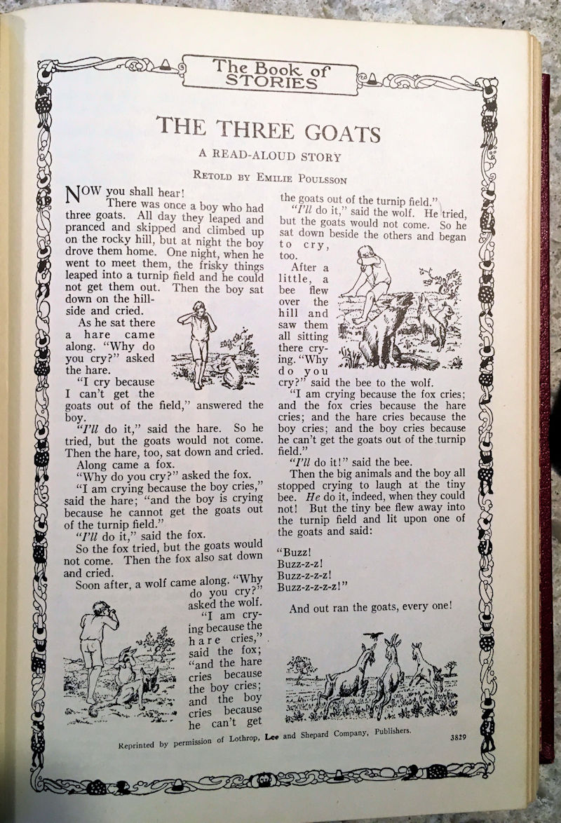
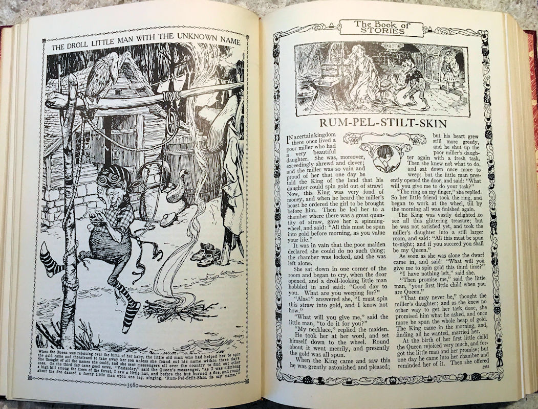
- The Book of Stories
- The Book of Poetry
- Things to Make and Things to Do
- French
These sections were present in each volume (French was not in the first volume) but even in the separate categories, the sub-topics were not arranged alphabetically. It was an idiosyncratic arrangement by theme and, apparently, whim.
While that might make it difficult for readers to find particular content, it was perfect for allowing its young readers to meander across the range of subjects without the artificial boundaries imposed by alphabetization. It was like a library of books arranged randomly on the shelves.
And just to make it more interesting, the sections themselves did not run contiguously in any volume.
For example, in Vol. 1, the Things to Make and Things to Do section has articles on pages 129 through 132, then jumps to 231 through 234, then jumps to 335 through 342. In between them are unrelated pieces on Famous Books, What is the Fastest Living Thing?, The Little Princes in the Tower, Canada, airplanes, The Cave-Men and Their Pictures, The Ship Beneath the Waters and so on. The structure seemed designed to encourage curiosity and exploration, but it also seems structurally confusing.
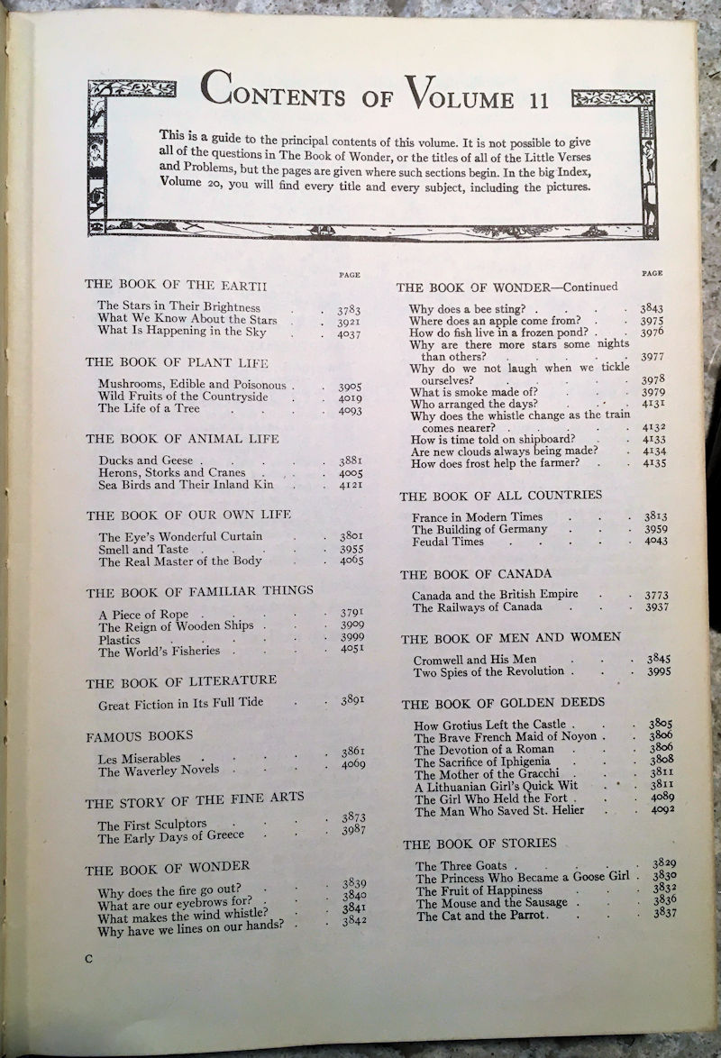
 Each volume opens with two pages of contents, listing all the articles under each category (“book”). Since articles are scattered throughout the volume, they don’t all reside in a group together on adjacent pages. For example, in Vol. 1, there are two articles in The Book of the Earth, on pages 17 and 235. in between them are articles from The Book of Plant Life, The Book of Animal Life, The Book of Our Own Life, and others.
There is a small disclaimer on each page of contents that warns, “It is not possible to give all the questions in the Book of Wonder, or the titles of all the Little Verses and Problems, but the pages are given where such sections begin.” So there’s more inside than listed.
 There is no visual way to determine where a volume begins or ends for readers to easily find that volume’s page of contents. In the first book (Vols. 1 and 2), Vol. 2 starts on page 385, but the contents page of Vol. 1 doesn’t indicate that. You have to thumb through the pages (numbered sequentially throughout the set) to locate where Vol. 2 begins. That’s a bit of a design oversight, because the contents pages are important when you’re looking for something particular in the set or book. But it’s a small flaw, easily rectified with a bookmark.
Let me segue a bit and talk about the “splendidly contrived index” the Britannica authors admired. The index — or rather indices since there are several — consumes the entire volume 20, running from page 7249 to 7698: 450 pages! It includes the following sections:
- How to Use the General Index
- General Index (261 pages)
- Principal Events of World War II (a three-page insert that ends with D-Day, June 6, 1944)
- How to Use the Poetry Index
- Poetry Index (20 pages, arranged by both author and first line)
- Analysis of School-Subject Guide (142 pages, arranged by ten general subjects, each subdivided into specific subjects: see below)
- Abbreviations in Common Use (four pages)
- Weights and Measures (two pages)
- The Quickest Way of Finding Things (two pages of mathematical formulae)
- The Population of the World (seven pages; in 1941 Canada’s population shows as 11,506,655)
The General Index is the familiar index of words and names, arranged alphabetically, with major and minor headings. The School-Subject index speaks to an impressive range of topics I assume was taught in the era. It is divided into ten general categories:
- Geography, History, Civics, and Economics
- Nature Study
- Physiology, Hygiene, and Psychology
- General Science
- Applied Science and Industry
- Things to Make and Things to Do
- Helps to Learning
- Biography
- English Literature
- Fine Arts
Each of these is further subdivided into sub-categories. For example the category Applied Science and Industry consists of:
- Food and Its Sources
- Clothing
- Important Manufactures
- Transportation and Communication
- Engineering
 And then the latter category is further subdivided into:
- Civil
- Mechanical
- Mining
- Electrical
The index for Applied Science and Industry is itself nine pages long, each line a reference to the title of an article in the books and the volume and page numbers, but not arranged alphabetically or in any discernible order. In Food and Its Sources, for example, the list begins:
- A Grain of Salt 3-925
- Coffee and Chocolate 6-2175
- The World’s Fisheries 11-4051
- How Flour is Made 8-2795
- The Story in a Tea-cup 2-761
- Where Sugar Comes From 10-3415
- The World’s Bread and Butter 1-369

And so on for 29 entries in this list alone. This is followed by two sub-sections: Things to Make (12 entries), and Wonder Questions (including questions like What makes us hungry? Why do we cook our food? Why does Swiss cheese have holes? Where does an apple come from? And so on for 30 such questions). All of this is pre-Google by about 60 years.
Other categories in this part have a Supplementary Reading sub-section, listing other, related articles for readers to explore.
The English and Literature index is divided into sections including Speech and Writing, History of Literature, Canadian, American and some other nations’ writers, then Poetry. Poetry is itself divided into 21 categories like Poems of Childhood, Poems of Love and Friendship, Poems of Sentiment and Reflection, The Conduct of Life, patriotic Poems, National Hymns and so on, for 14 pages. The entries in each category are alphabetized, but the categories themselves are not arranged thus.
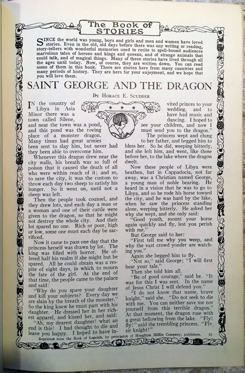
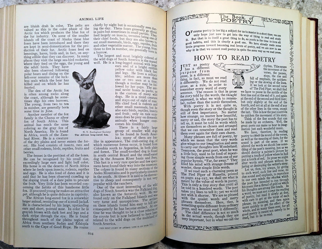
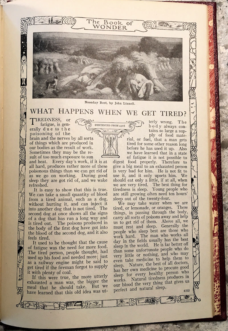
You can see the influence of design standards in the books from its earliest days: many pages exhibit extravagant typography and layout with strong Art Nouveau leanings, and a bit of Art Deco influence. The complexity of a page layout and the mix of elegant typefaces are more evident in earlier sections than those added or amended later.
 Many pages have decorative (graphic) elements, and drop caps; there are some pages with type run-around, not simply straight columns (keep in mind this was not set on a computer but every page was typeset by hand).
Lots of attention was paid to the visual impact of elegant fonts in headlines. I have not found anything in them to indicate which typefaces were used (publishers sometimes include such statements), but there are several used, all serif faces, including the occasional slab-serif. I recognize most, but not all, although I can’t name them (yet).
You can also see the difference in typefaces between older and newer material if you look closely (newer material seems to be set in a modestly lighter weight; I mean to examine the fonts more closely with my type catalogues and the What-the-Font service and try to identify them). The difference in weights suggests to me that different typesetters were used for later editions.
William Morris would have been proud: no nod to the Bauhaus minimalism here! Sans-serif fonts cannot even be found within. As one website notes about the Art Noveau style:
Art Nouveau typography often contained letters that were elongated, embellished and feminine in nature. Asymmetry, or the use of irregular shapes in design, was an important feature of Art Nouveau typography. The Art Nouveau style was inspired by the curved lines of organic shapes found in nature and was distinctly different from more common geometric typeface designs. Rather than having a manufactured appearance, Art Nouveau typography had a calligraphic or handmade look.
 The passion and exuberance of the designers show on so many of the pages. This set is as much a work of art as a work of information. It’s hard to tell from the rather drab covers, but inside it’s a marvellous, well-crafted and well-designed work. You can find, if you look carefully, indicators of the passage of time as some content (and its design) were frozen while that (and the design) in other topics changed and expanded to open themselves to new information, updates, and corrections.
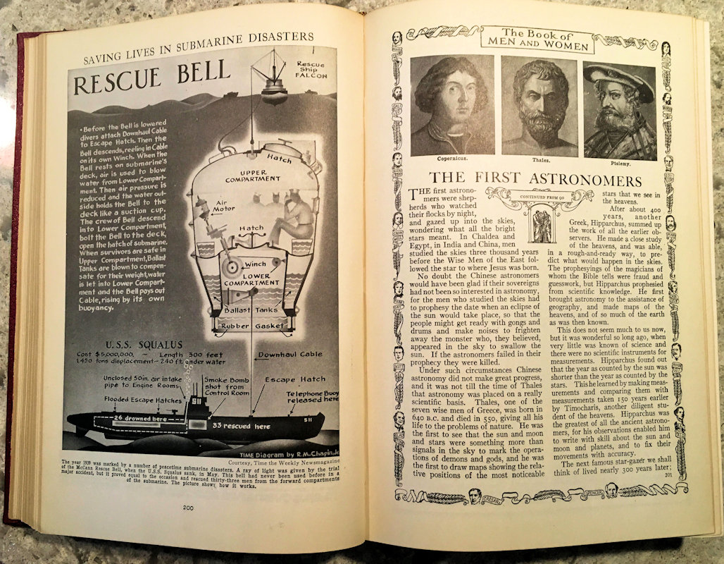
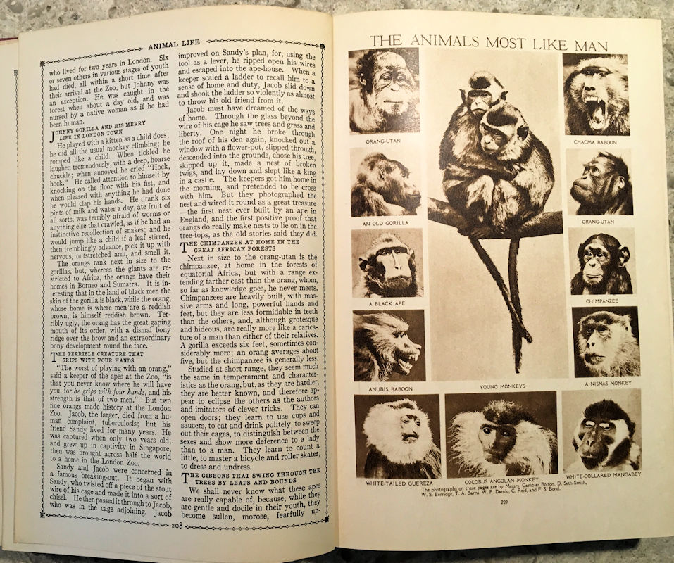
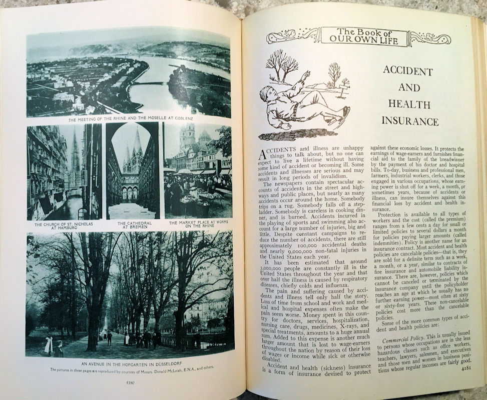
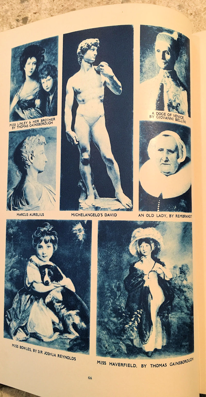
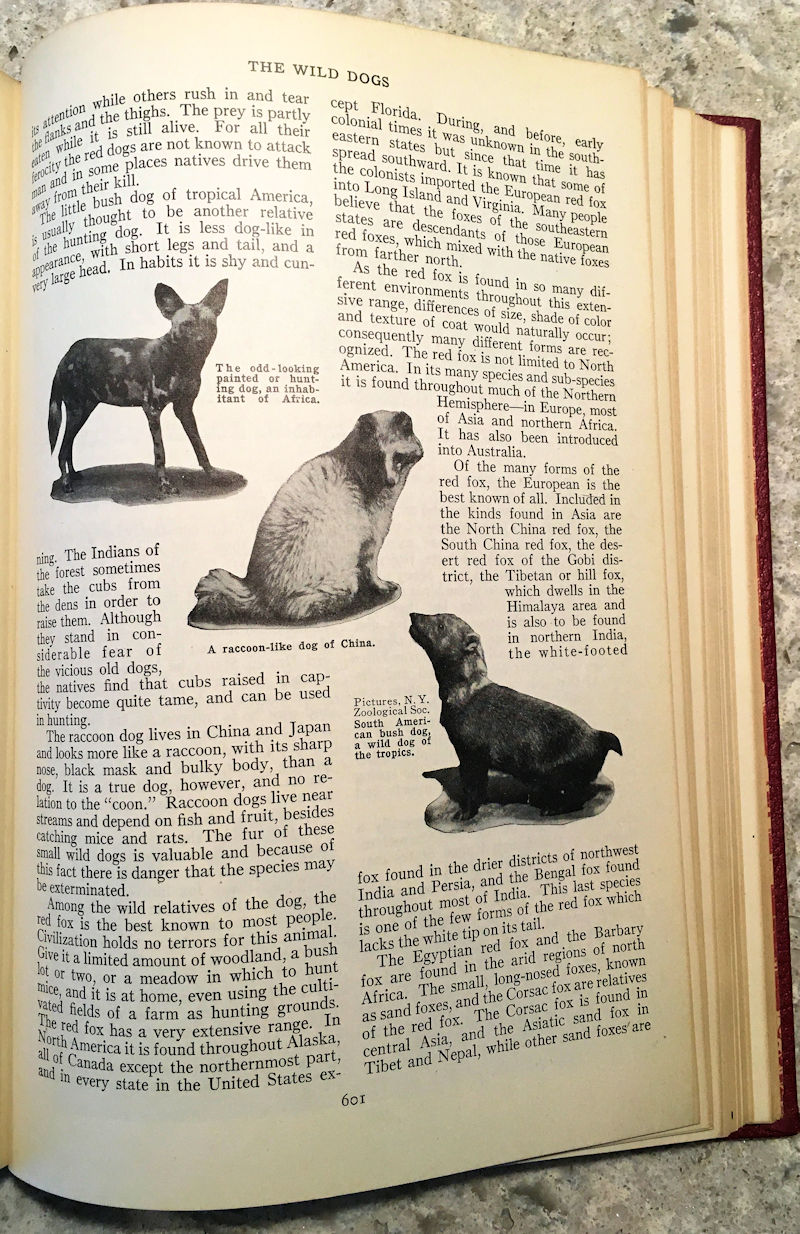
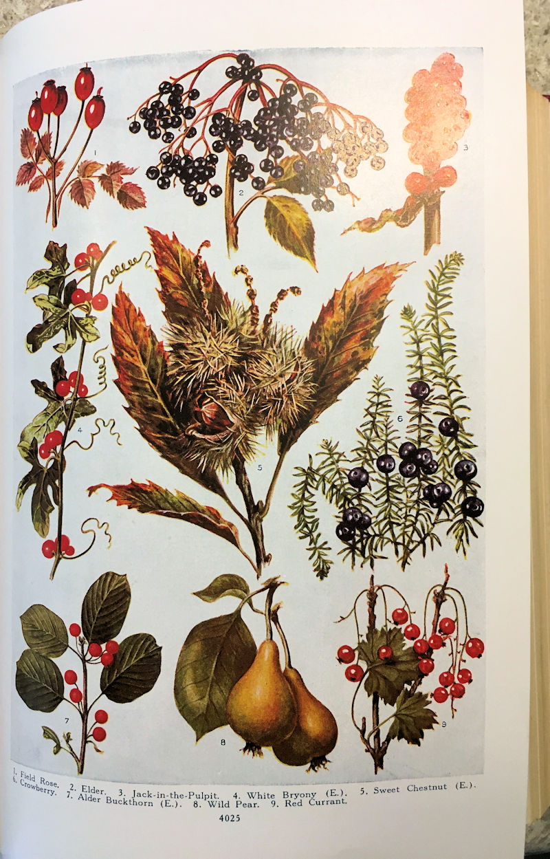
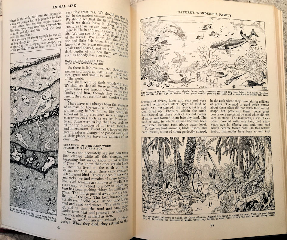
There are many illustrations in the set; from simple line drawings to engravings to greyscale photos, cartoons, duotone photos (in blue), sepia photos, and even pages of full-colour images on glossy stock.
Red ink was used as a highlight on several pages. You’ll note, too, that while the pictures of classical female sculptures sometimes show their breasts (often shadowed or turned away to avoid displaying a *gasp* nipple so as to avoid unduly titillating young readers), the genitals of the males — commonly carved in great and affectionate detail in Roman and Greek sculpture — are carefully air-brushed or fig-leafed out. Protecting impressionable minds: can’t let the young know all about anatomy, can we? Well, it was 1945, after all.
 Of course, being a product of its time, it shares many of the biases common to the West in the first half of the 20th century. Not all of these are palatable today, and it doesn’t give much coverage to content outside European and North American cultures. The old Western imperialism that would crumble post-WWII was still standing strong among these pages. While you can’t quite hear the trumpets playing the national anthem or Rudyard Kipling’s voice reading, it’s clear that many articles were written between the World Wars. The appreciation of Asian and native cultures, religion, history, and literature was years away from developing.
 There’s an article called How Wealth is Created (1-5357) that recalls the basic tenets of conservative capitalism, with comments like “to labor aided by the inventions and discoveries of clever men, and exercised in a properly organized way, the possibilities of wealth production are for practical purposes unlimited.” And, “Saving becomes very important, for without it all the clever inventions of machines and appliances would be useless.” Many articles have this sort of “life lesson” in them.
But it also says, “One great difference between the work of a savage and the work of a civilized man to-day is that the savage worked with a very tiny stock or capital, consisting of a few weapons, tools and lots, while the civilized man works with a big stock of buildings and machinery.” Savages and civilized man, oh my. Maybe I did hear Rudyard Kipling’s voice.
 Sex gets a single line in the index: but only a reference to plant reproduction. Human reproduction itself is coyly covered in a single article titled Why Are We Like Our Parents? (15-5613) that opens with a reference to the Bible (the seed of Abraham) and goes on vaguely to waffle about the “mysteries and power of life” in that seed, meandering into Mendel and his study of genetics, and some further comments on heredity. There is nothing about the actual mechanics of reproduction, much less any of those medically-accurate illustrations of reproductive organs found in later encyclopedias. Birds do it, bees do, but apparently young readers weren’t to learn in this set that even educated fleas do it.
It’s full of tales of men: women don’t get much if any coverage as heroes, authors, inventors, or creators. Under The Book of Men and Women we find articles like Men Who Made the World Known, The Men Who Mapped the Skies, Some European Men of Science, The North Pole Men, Some Famous Monks, The Men Who Gave Us Schools, Some Men Who Loved Nature, and so on. I haven’t found any overt women-belong-pregant-in-the-kitchen references, but most of the photographs of people doing important things like building or researching are of men.
 Marie Curie, for example, gets a few short column-inches on page 388, described somewhat condescendingly as a “woman-genius” but the description of her discovery of radium is shared with her husband, Pierre (although she began her research several years before marrying him). It mentioned her winning the Nobel prize, but doesn’t mention she was the first woman to win it (she’s also the only one to win it twice). The word “man” is used generically to mean humankind throughout. Wouldn’t pass muster in today’s more liberal curricula.
In one article in Vol. 2, the Bible is called “The Greatest Book in English”(page 475) and the entry under that title conveys the contemporary Christianity-is-the-best-religion-ever view. I found it amusing to read that “all men can find endless profit and entertainment in its pages.” I wasn’t aware I could make money reading it. Perhaps I’m being facetious. But overall the set is not particularly religious. There’s no “in God we trust” stamp on everything (and it doesn’t describe dinosaurs as victims of the mythical Flood).
It’s also got that expected, wartime patriotic slant: the set opens with a two-page piece on Winston Churchill: The Symbol of Britain, a “man so forthright and so fearless,” with a picture of the old Bulldog looking suitably determined. Stiff upper lip and all that. Keep in mind that this set was published before VE Day (somewhat remarkable in itself that it could be published during wartime). But even so, by today’s standards, the political, sexual, and social views presented in this set are as musty as the books themselves (when this set was published, the USSR was an ally, so care was taken to describe without criticizing the Communist government). Most are, however, not as offensive as merely outdated.
Still, it’s a beautiful work and the effort put into making it so should not be forgotten (the binding alone is a work of art in itself and still holds strong after more than 75 years). These books don’t deserve to be relegated to the trash solely for their outdated opinions: they have art and aesthetics within those covers. And the set has value as a historical record of those views, for those so inclined to measure the past against the present.
 For more than 50 years, versions of this set of encyclopedias provided knowledge and entertainment for generations of parents and children in the UK, Canada, and the USA. They helped form the views of the inter-war generation and the later Boomers like myself, too, although how much any one encyclopedia can influence a generation is hard to measure (I don’t even recall seeing this set on any library shelf in my school days, but to be fair, I wasn’t looking for it at the time). And this set itself probably was beloved in a family setting for at least two generations until, finally, it was banished to the basement or garage. I like to think that its owners were reluctant to get rid of something that had been in the family so long, and that it contained many fond memories for them.
Here, let me show you some more images… click on any of them to see a larger size. I can provide more images if anyone wants to see some, or wants to examine either a particular article, page, or detail. I hope you’ll agree they are visually well-crafted.


I’m still not sure what to do with these books after I’ve finished looking through them and determining what typefaces were in use. My sense of wonder and delight can only take me so far: after that, I have to decide where to store them or find a more suitable home where they will continue to be appreciated (they’re still a bit musty and need airing).
I’m open to suggestions.
~~~~~
* The copyright information in this 1945 set includes The Grolier Society 1926-35; The Amalgamated Press (1922) Ltd, for 1923-35; The Grolier Society Inc. 1937-45, and The Grolier Society Ltd. 1940-45. The latter was the Canadian copyright registration, which makes me believe this set was published in Canada for Canadian readers.

http://messybeast.com/history/books-of-wonder.htm
I came across this site after I had written my piece, above. It’s about the joys of old encyclopedias, including The Children’s Encyclopedia, which is the forerunner of The Book of Knowlege, as well as several encyclopedias. There are numerous photographs of them many sets, although few of their interiors. Click the link at the very bottom to see a list of vintage images from some (and other sources).
I’ve been searching for a match for the base text’s (and many of its headlines’) typeface and as yet can’t find an exact match. However, it appears to be set in a version of Century (now sometimes sold as Century Old Style by various type foundries), or perhaps even Century Schoolbook. This is also known as New Century Schoolbook, an upgrade to the original that appeared somewhat later.
Century was released in 1894, and Century Schoolbook in 1918 (some sources say between 1917 and 1923 because bold came out in 1921 and italic in 1923), which fits with the genesis of the encyclopedia (its first versions released in 1912). However, while many characters match in either face, none seem to match all the characters in the set. See Wikipedia:
Century type family – Wikipedia
Some dropcaps are set in another font, as are some headlines and cutlines. I have yet to explore them. Some pages have three different typefaces on them, too.
And I was wrong about the absence of sans-serifs. The cutlines below the pictures on pages 68 to 72 are in a sans-serif font. Hmmm… are these a later insert or addition? More later…